
Galaxy Lamp – Packaging Design
Turning a functional product into an immersive, giftable experience.
Overview
Galaxy Lamp is a consumer product packaging project focused on creating a visually engaging and commercially viable design system for a decorative lighting product.
Problem
Generic product packaging in this category often lacks emotional appeal, making it difficult to differentiate in retail or e-commerce environments.
Insight
Lighting products are often purchased based on atmosphere and emotion, not just function—packaging should reflect the experience, not just the product.
Solution
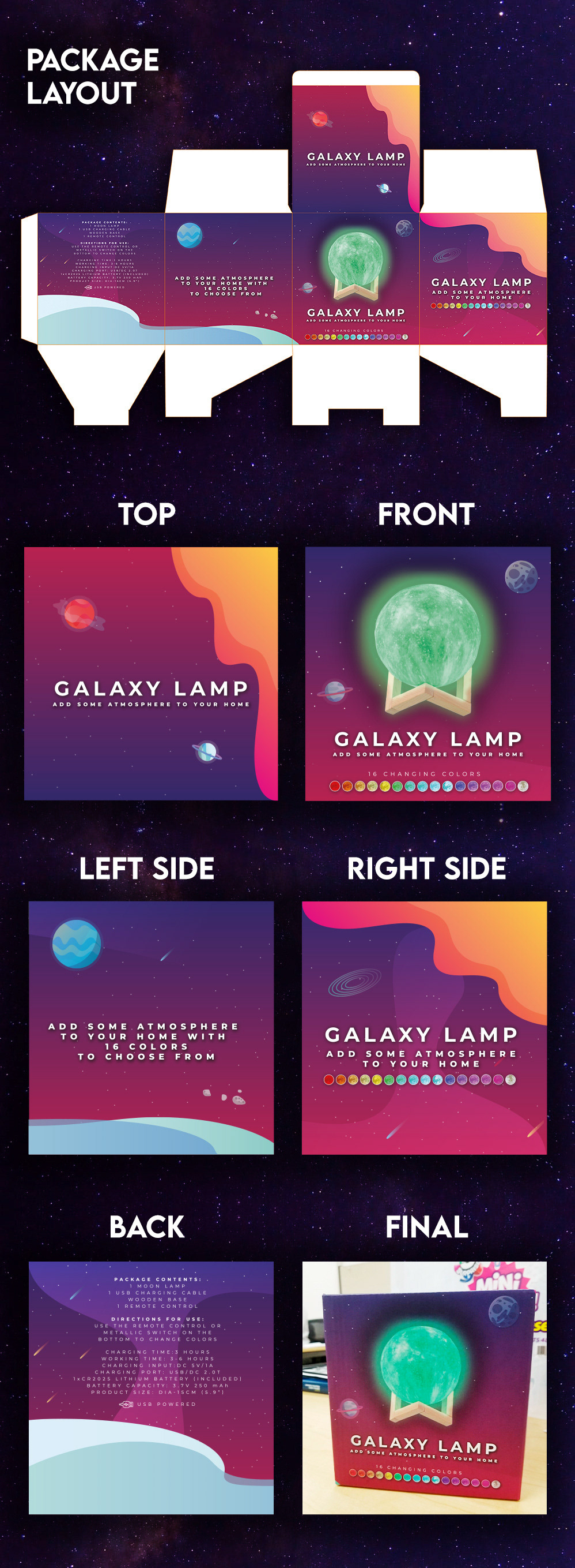
Designed a packaging system that emphasizes immersion and visual storytelling, using galaxy-inspired graphics, color gradients, and lighting effects to communicate the product’s ambiance and appeal.
Balanced aesthetic impact with clear product communication to ensure usability across retail and online listings.
Execution
• Developed cosmic-inspired visual language and colour system
• Designed packaging layout with strong visual hierarchy
• Integrated product imagery to showcase lighting effects
• Created a cohesive front/back packaging system
• Optimized design for retail display and digital thumbnails
Outcome
A visually compelling packaging solution that elevates perceived product value and enhances shelf and online presence—demonstrating strength in packaging design and consumer-focused branding.