
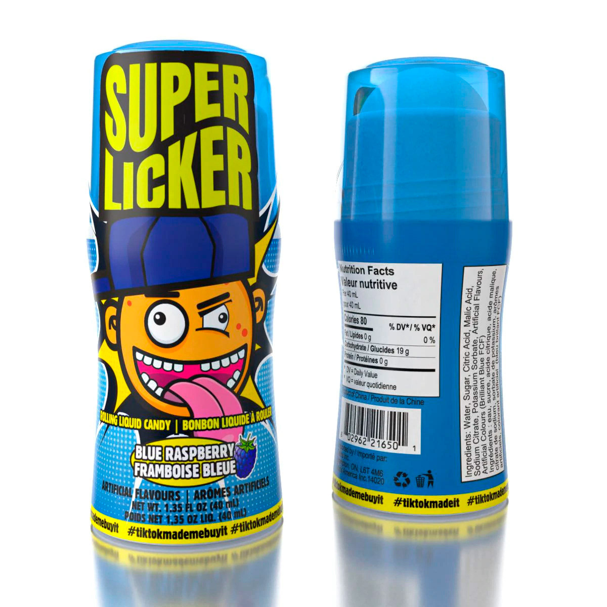
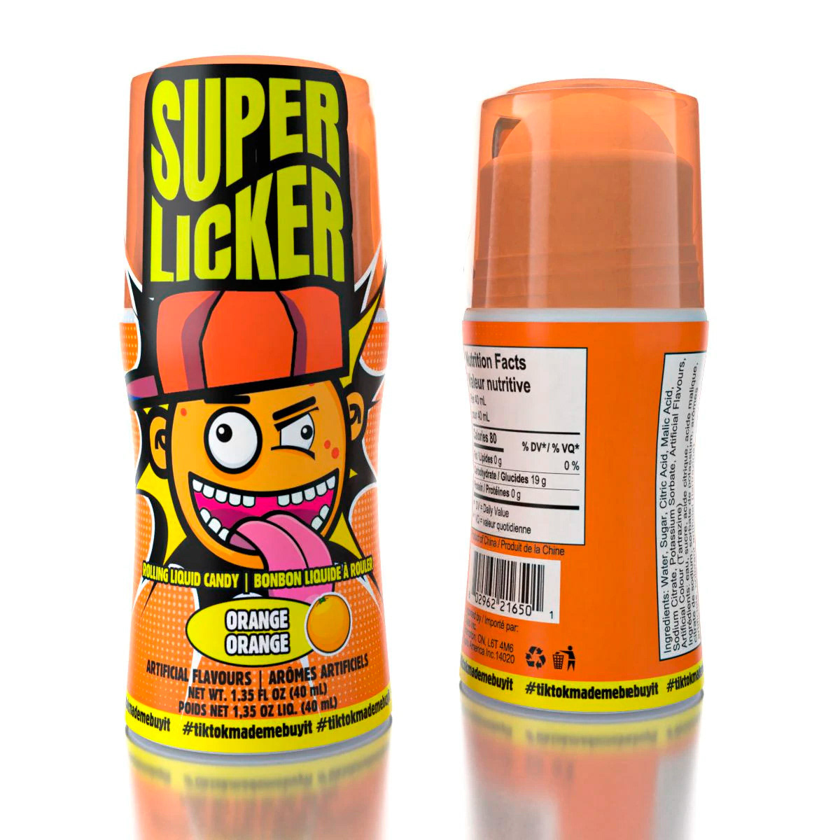
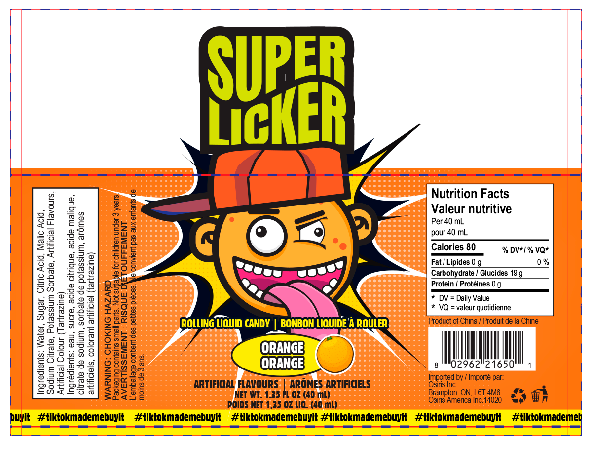

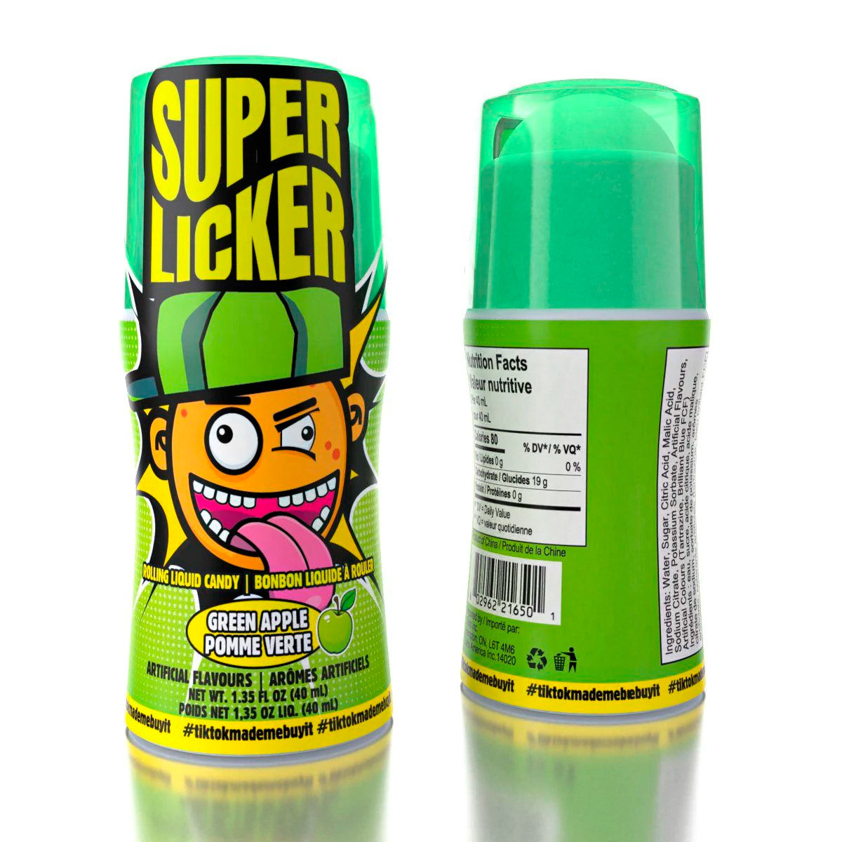
Super Licker – Packaging & Brand Identity
Creating shelf-dominating packaging through nostalgic energy and bold design.
Overview
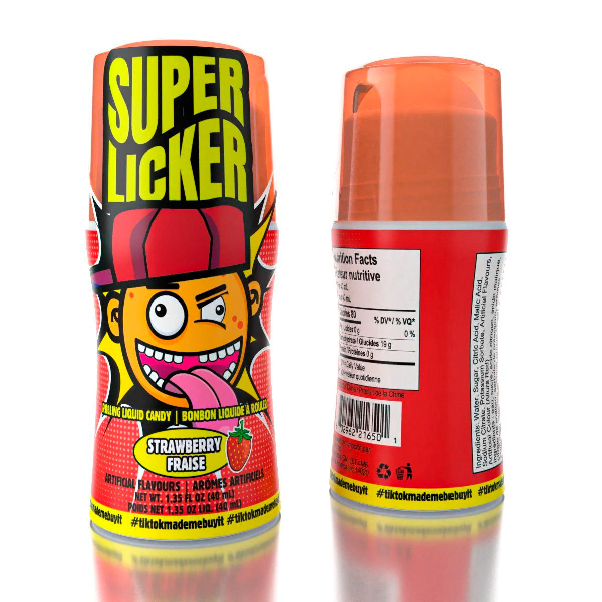
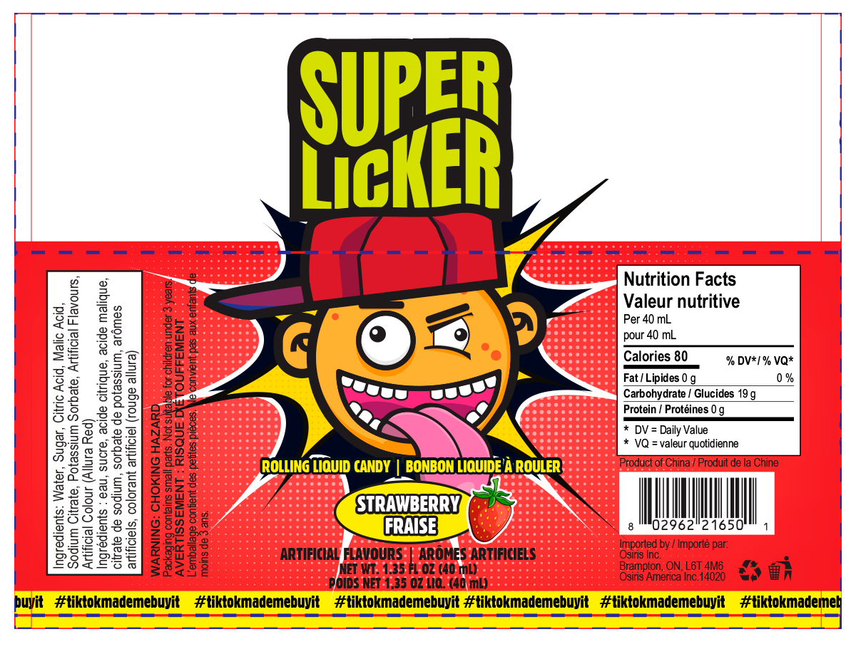
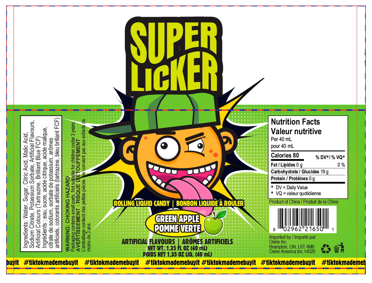
Super Licker is a private-label candy product developed for Showcase, focused on high-impact retail presence.
Problem
Candy products compete in crowded environments where immediate visual attention determines success.
Insight
90s nostalgia, combined with bold, high-energy visuals, creates instant recognition and emotional engagement.
Solution
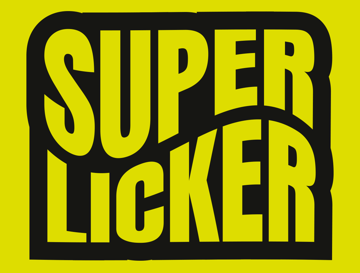
Designed a vibrant identity system inspired by retro candy culture, using expressive typography, neon palettes, and dynamic layouts to maximize shelf impact.
Execution
• Designed bold logo and typography system
• Built high-contrast neon color palette
• Developed layered graphic elements
• Created packaging optimized for visibility
• Established cohesive visual system
Outcome
A visually striking product identity that stands out in competitive retail spaces while reinforcing fun, nostalgia, and brand energy.